data542
Bruce McMinn — Data Engineering & Analysis
Data engineer and analyst based near Bellingham, WA. Building pipelines, architectures, and tools at the intersection of engineering and insight. These are some projects I'm particularly proud of.

WeatherFlow Live Dashboard
Real-time weather data pipeline from a personal Tempest station through AWS Lambda and CloudFront into a live Power BI report.
View Report →
Stock Picker
Technical indicator engine using ATR, RSI, Supertrend, and VWAP signals to surface trade candidates, visualized in Power BI.
View Project →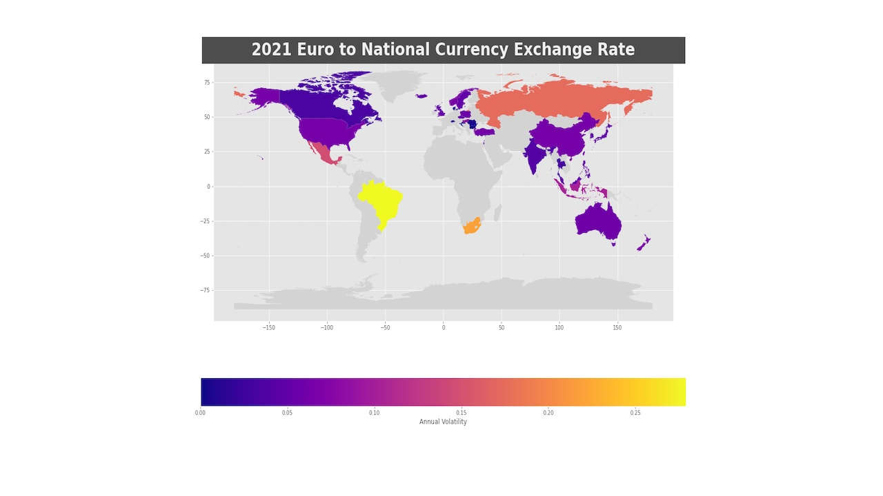
Euro on FOREX
Twenty years of Euro exchange rate volatility across 40 currencies. Geopolitical events mapped against market movement, with an animated annual volatility world map.
View Notebook →WeatherFlow Live Dashboard
Real-time weather data pipeline from a personal Tempest station through AWS Lambda and CloudFront into a live Power BI report.
View Report →Stock Picker
Technical indicator engine using ATR, RSI, Supertrend, and VWAP signals to surface trade candidates, visualized in Power BI.
View Project →Euro on FOREX
Twenty years of Euro exchange rate volatility across 40 currencies, with geopolitical event annotations and an animated annual volatility world map.
View Notebook →